Brittany Egan
Thursday, May 26, 2011
Thursday, May 12, 2011
Tuesday, April 26, 2011
Monday, April 25, 2011
Wednesday, April 13, 2011
Portrait Diptych
Thursday, March 31, 2011
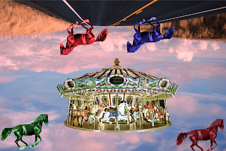
Surrealism Photo montage
The theme of my photo is one of my childhood memories. Every summer when i was young i would go to seaside and my dad would take me on the carousel. when i was younger the constant going around in circles would me me feel like my head was in the clouds thats why i flipped it. i really like it though. i added the horses to make it look a little different and change there colors to make it look more surreal.
Monday, March 28, 2011
Surrealistic Theme
For my Surrealistic project I am going to put a carousel in the middle of a street with a picture of real horse jumping out of the carousel and lightening hitting it. I'm using carousels because i love them.
Friday, March 25, 2011
traditional vs digital
Artists name: Rene Magritte
Title of Artwork: Son of Men
Date of Work: Unknown
In this photo the person is standing in front of a brick ledge. He is wearing a suit that is dark maybe black or blue. He has a white shirt on with a red tie and a hat. He is standing in front of some kind of body of water and he has an apple covering his face.
The artwork seems very organized. He is standing in the middle of it which makes it symmetrical. The colors go well together. You can tell the difference between the water and the sky and the apple shows mystery.
I think the artwork looks this way because Rene is trying to show us how people aren’t always what they seem. He might also have it this way because of the way his mother died.
I think of all his work is successful because it is all really original. Also his pictures make people think. Whenever I see one of his pictures I always think “what’s going on?” and that are what draws me to it.
Artist Name: Salvador Dali
Title of Artwork: Exploding Clock
Date Of Work: Unknown
In this picture there is a broken clock. The clock is falling. Everything about this picture is broken. There seems to be a dead butterfly in the corner. It’s strange because even though the picture is messed up the background shows a beach which seems tranquil.
The Design is bright. Nothing seems dark about this. The shadows make it look more realistic as well. The sky is a good shade to because it shows that it’s in the evening but not exactly night time yet.
I think the artist was trying to show that even if a clock is broken time still moves. I think the picture represents that the artist believes time means nothing really. If he believed in time I think the clock would be perfectly fine. Or maybe the artist is trying to show that he himself doesn’t have enough time left.
I think this picture was done wonderfully because it really makes me think. I really like this picture because it reminds me of the quote “ that even a broken clock shows the correct time once a day” I really love this picture.
Thursday, March 17, 2011
Tuesday, March 8, 2011
Wednesday, February 23, 2011
Thursday, February 10, 2011
This picture is by Anesel Adams. i chose this picture because I've heard of him before and because it reminds me of the journey I have accomplished to make it this far in life.
This picture is by Gregory Credson. I think it shows that this man is trying to fly. I think that flying is this man's dream and it makes me happy to think he isn't giving up on it.
This picture reminds me of a woman who is lost and trying to figure out life. It reminds me of myself because I'm lost right now, I'm graduating soon and leaving a place that has been home for four years to move on.
.
This picture is by David Muench. I like this picture because of the look it has. This picture reminds of all the snow we have had this year and even though its a mess its still beautiful
I really love this picture. I think I enjoy this picture so much because I love stars. I remember learning and seeing this picture in Elementry School and I just always liked it.
 |
| Anesel Adams |
 |
| Gregory Credson |
This picture is by Gregory Credson. I think it shows that this man is trying to fly. I think that flying is this man's dream and it makes me happy to think he isn't giving up on it.
This picture reminds me of a woman who is lost and trying to figure out life. It reminds me of myself because I'm lost right now, I'm graduating soon and leaving a place that has been home for four years to move on.
.
 |
| David Muench |
This picture is by David Muench. I like this picture because of the look it has. This picture reminds of all the snow we have had this year and even though its a mess its still beautiful
 |
| Vincent Van Gogh |
Tuesday, February 8, 2011
My Name: Brittany Nicole Egan
Childhood Ambition: To be a teacher
Fondest Memory: Summers in Seaside/Summer 2009
Soundtrack: Speak Now- Taylor Swift
Retreat: My sister’s house
Proudest Moment: becoming an aunt
Biggest Challenge: 9th Grade Year
Alarm Clock: My phone
Perfect Day: spent in the pool, soaking up the sun
First Job: babysitting
Indulgence: music
Last Purchase: clothes
Favorite Movie: The Bucket List
My Life: is one crazy mess of hopes and dreams
Subscribe to:
Comments (Atom)


